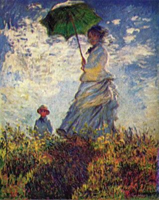
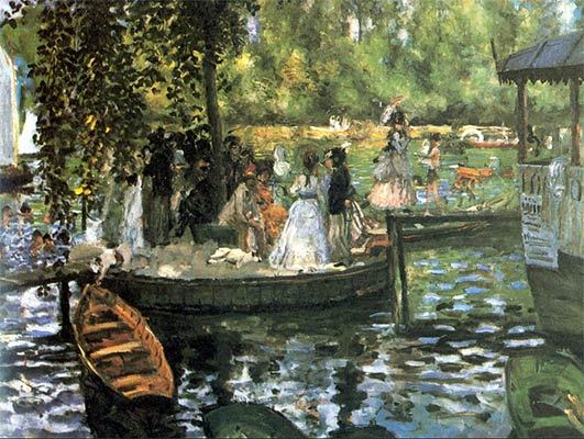
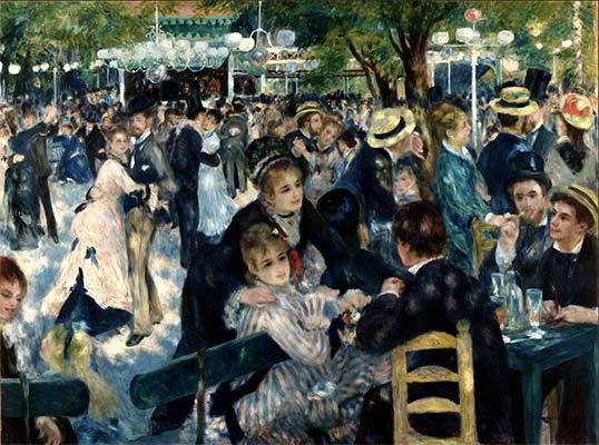
The picture shown above is one of my favourite paintings done by Monet. Monet and Renoir were impressionist artists, although Renoir also created other paintings. The goal of an impressionist artist is to create a picture that is realistic but at the same time, it’s an image that they imagine, an impression. Whether it be an object, person or landscape, they wanted to express the movement and life that they viewed and show it in their artwork.
Impressionist artists wanted to portray the effects of outdoor light, while other artists painted models and whatnot. The paintings that Impressionists created revealed their view of the world around them. From flickers of sunlight to soft shadows and warm tones that can be seen through many paintings. You have to first observe the behaviour of light and darkness to be able to be an impressionist, you have to appreciate the light and colour.
I really enjoy just looking at their paintings, I feel extremely calm when I sit down and observe them. Many paintings have a lot to look at, and there are a lot of small details that I like paying attention to. These details might not be as important as the actual painting but, I like spotting them anyways.
The impressionist era was an interesting and beautiful time, there were many different tones and values interpreted into the pieces. I would love to see modern artists try impressionism.
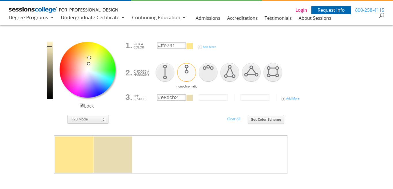
Sometimes you know what you want to paint but, you really can’t figure out what colours you want to use. This is something I struggle with, usually I have a hard time picking colours that go together and look nice. I like warm undertones rather than cool undertones. This may sound peculiar but, I like connecting to my colours. They should connect to me at a personal level, whether it relates to my favourite season or even the colour of my bed sheets. After a while of research and time, I finally how to pick good colours; colour wheels, or if you are desperate, use colour calculators. This one is good: https://www.sessions.edu/color-calculator/
These are the Colour Schemes that I use:
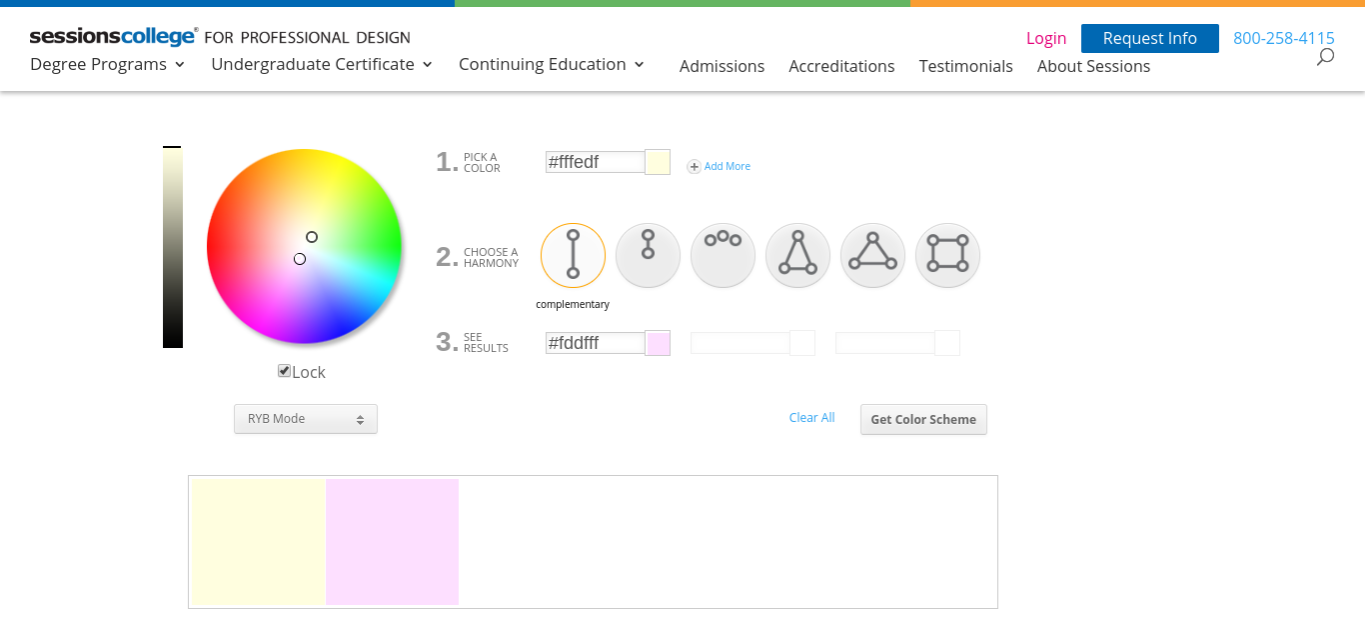
Monochromatic
Monochromatic colours are all of a single hue/tone, just choose one colour and you are done! Let’s say that you have chosen blue, you would also use the lighter or darker shade of that colour. Although it lacks colour contrast, it makes your painting look clean and smooth, since they are from the same shade, this is nice because the colours go together and look calming. It also allows you to comfortably alter the darkness and lightness of your colours.
These colours are nice for a Sunset
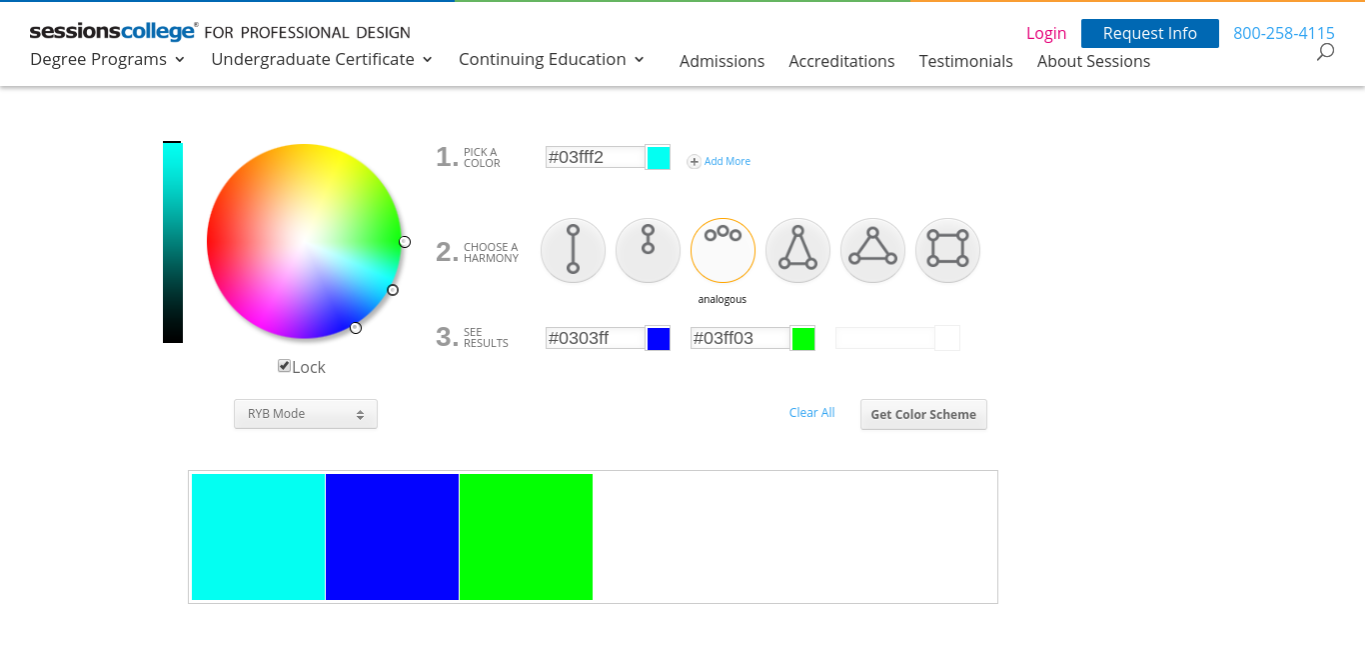
Complementary
Complementary, it’s all in the name, the colours complement each other. This scheme presents a large amount of colour contrast. Pick two colours, use of two colors directly across from each other on the color wheel and suitable tints of those colors. Using these tints can create a bright and radiant look or a soothing and sophisticated look, it all depends on the colours. The colours could be blue and orange (opposite sides of the palette) or, pink and green. Thinking about those colours may sound unusual but, once you actually start your painting then they will complement each other.
Soft colours that go well together
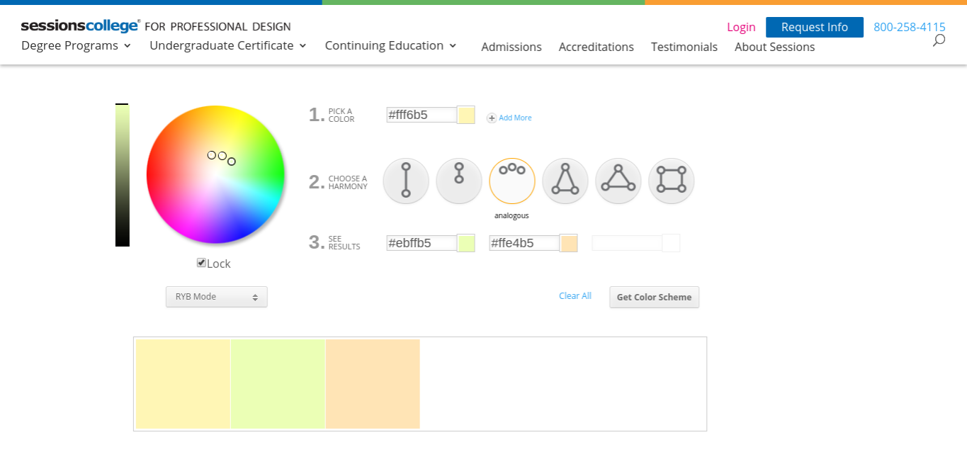
Analogous
This one has to be my favourite among them all. This scheme uses colours that pleasingly balance out. This scheme is formed by pairing one main color with the two colors directly next to it on the color wheel. Colours like, red, orange and yellow, these colours are right next to each other on the colour wheel and complement each other tremendously. There are drawbacks though, everything has a drawback, and so does this scheme. When painting try to avoid using too many analogous colours. This might just make the meaning of the painting fade, this is because there will be too much going on in your painting. There will be too many colours and will ruin the flow of the particular area, having too much isn’t always a good thing. Aside from the drawback, analogous structures, and I can’t stress this enough, are meant for softer and lighter colours! I find it extremely annoying when people use such vibrant and high contrasting colours, it’s just too much for my eyes… please, please for the love of god, don’t use vibrant colours, the only thing you will accomplish is making people’s eyes HURT!
(Unless you’re amazing at art and can somehow pull that off, then kudos to you!)
PLEASE DON’T USE THESE COLOURSThis Palette is Nicer
Conclusion
These aren’t the only colour schemes, there are a few different ones that are equally as good. The three that I wrote about just happen to be my favourite, do some research on your own and figure out what scheme connects to you the most!
Why did I start painting? How have my feelings towards painting evolved over the past couple of years? Why do I still paint? No joke, these are questions that I ask myself all the time. I feel like painting just happened, it’s like when you’re out on a walk and stumble across a quarter, it’s like that with painting too. I just, stumbled across it, it just happened to come into my life.
All About ME
Now, I’ve always been a creative person, and a person with an interesting imagination. When I found something boring I would dilute those noises and fly off into an imaginary world. I would often get called out by my teachers, that was the major draw back. The major event that I can recall from my childhood was when I mixed various paints into a cup. As a kindergartener I was filled with curiosity, and without much instruction, I decided to test some things out. I was utterly fascinated by the fact that after mixing all of those paints, the colour just changed. My teacher on the other hand, certainly did not feel the same way. She was enraged that I mixed those paints, now that I’m older I understand, but as a kid, I couldn’t do anything but cry. I wasn’t really allowed to paint at home because I was a very messy and clumsy so I painted in art class at school. I should correct myself; I still am clumsy, I remember spilling water on one of my best paintings, I guess clumsiness doesn’t disappear over time. Back to art class, my teacher was a very good teacher, he taught me a lot of things that I still recall. Many techniques and values. That was the only the beginning though, over time, I learned many new skills and practiced painting over and over again.
dav
Starting Off
There was a time when I felt very confident about my art. In that period, I was most probably, definitely the cockiest child on earth. I would pretend to be modest when others complimented my artwork, “Oh no, I don’t think it’s that good, but thank you”. I was such a confident, outgoing and had a lot of ego. Thankfully, I’ve lost all of that ego and fake modesty and cockiness, those aren’t great traits. I realized that everyone has some form of meaning when they create a piece, whether the meaning is significant or not.
At that time I would look outside a lot
How I improved
Started in grade 8, ruined in grade 9
Patience, time and effort. You cannot accomplish much without these things, I’ve only applied those three things into improving my skills in painting (I should probably do the same in other aspects as well). Something that I now understand is that, the outcome of something may not always be to your liking. You can’t really do much so you just have to accept that and work harder. That is what I did. My dad, who’s pretty good at art gave me many tips, and my mother, helped me figure out good colour combinations. I would place holds on many art books as a kid, eagerly thriving to learn new things such as techniques. I also loved looking at pictures from my favourite artists, they really inspired me.
How It Has Helped Me
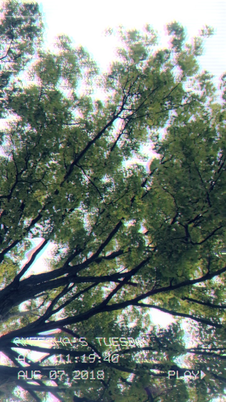
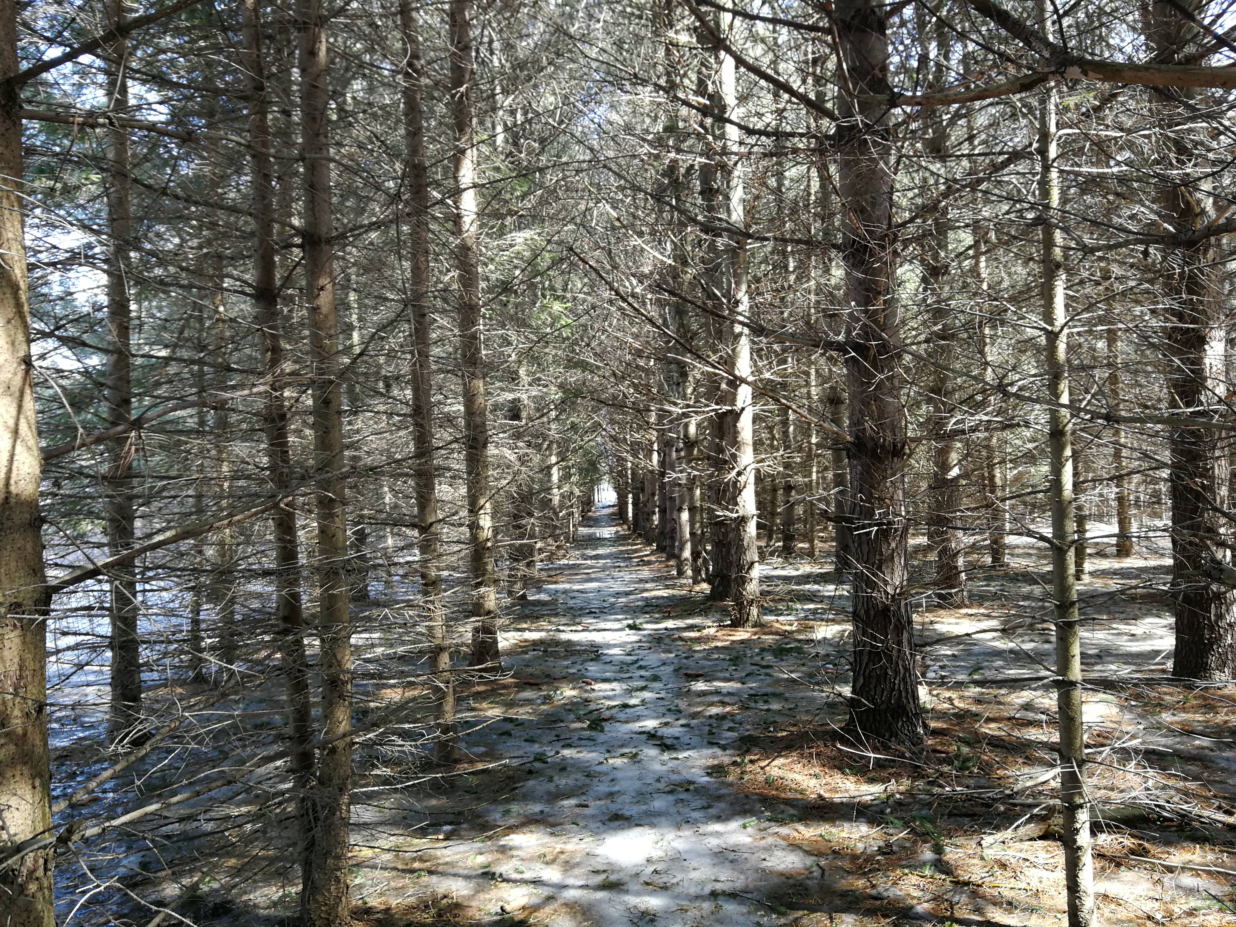
My Mother took this picture when she went on a trip. It motivated me to pracitce painting the world around me.
I feel like many things have changed over the past couple of years, my painting style has changed and so has my mentality. Painting undeniably relieves all the stress and negativity that I have inside of me. I often show a lot of emotions when I paint, I might cry, I might ‘accidentally’ break my brush, or I might just silently think and work. I like most of my paintings to convey some sort of message, although, sometimes I don’t. Putting all of that aside, finding the motivation to actually sit down and paint is the most difficult part. For the past few months, I’ve been going outside and observing many things around me. This has helped me tremendously, to find inpiration AND motivation. Thank you Mother Nature.
Forest
Conclusion
I’ve spent a lot of time thinking about a lot of things, I’ve put in a lot of time writing these blogs as well and odd enough, I feel super motivated! Writing about something is as helpful as going outside as well. I’ll be painting soon, this time I will have many ideas and a lot of expressiveness to express in my art.
Everyone has different tastes, whether it’s; music, books, movies, or anything. It is the same for paint. Some people prefer oil paint, some prefer watercolours, acrylic, gouache or even tempera. The paint that I favour more is acrylic. One of the key features that I adore is that it drys quickly, unlike quite a few other paints. If you play around with it or mix it, it will turn into a thick, buttery consistency. Once it becomes thick you will be able to add texture to your painting. In this blog I will be talking about various techniques using acrylic paint, I will also provide visuals for better understanding.
Sgraffito (Scratch)
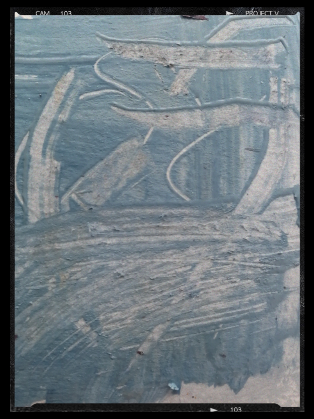
This term comes from the Italian word: sgraffire, which literally means ‘to scratch’. This techniques involves scratching the top layer of paint that is still wet. The point is to reveal the bottom layer, the bottom layer could have another layer of paint or just the white canvas. You can use any object to do this technique, some examples are; the end of a paintbrush, the corner of a card, a palette knife or even your fingernail.
You can see the bottom layer
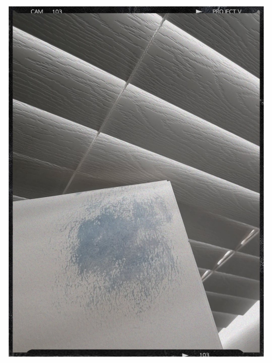
Dry Brushing
This a great technique to add texture, highlights and/or dimensions. If you look close at a painting, especially landscape paintings, you will notice this technique. You can use this technique to create clouds – this will give the clouds more value and texture, you can also create streaks of grass. Now what does a dry brush feel like and how do you make the paint “dry”? All you have to do is; load your brush with paint, and dab it on another surface. It should still hold the paint but at the same time, be relatively dry. When you put your brush on your surface, the brush strokes should look scratchy, it should lack the smooth texture that normal paint has.
The strokes are rough, if you add more detail you could create a cloud.
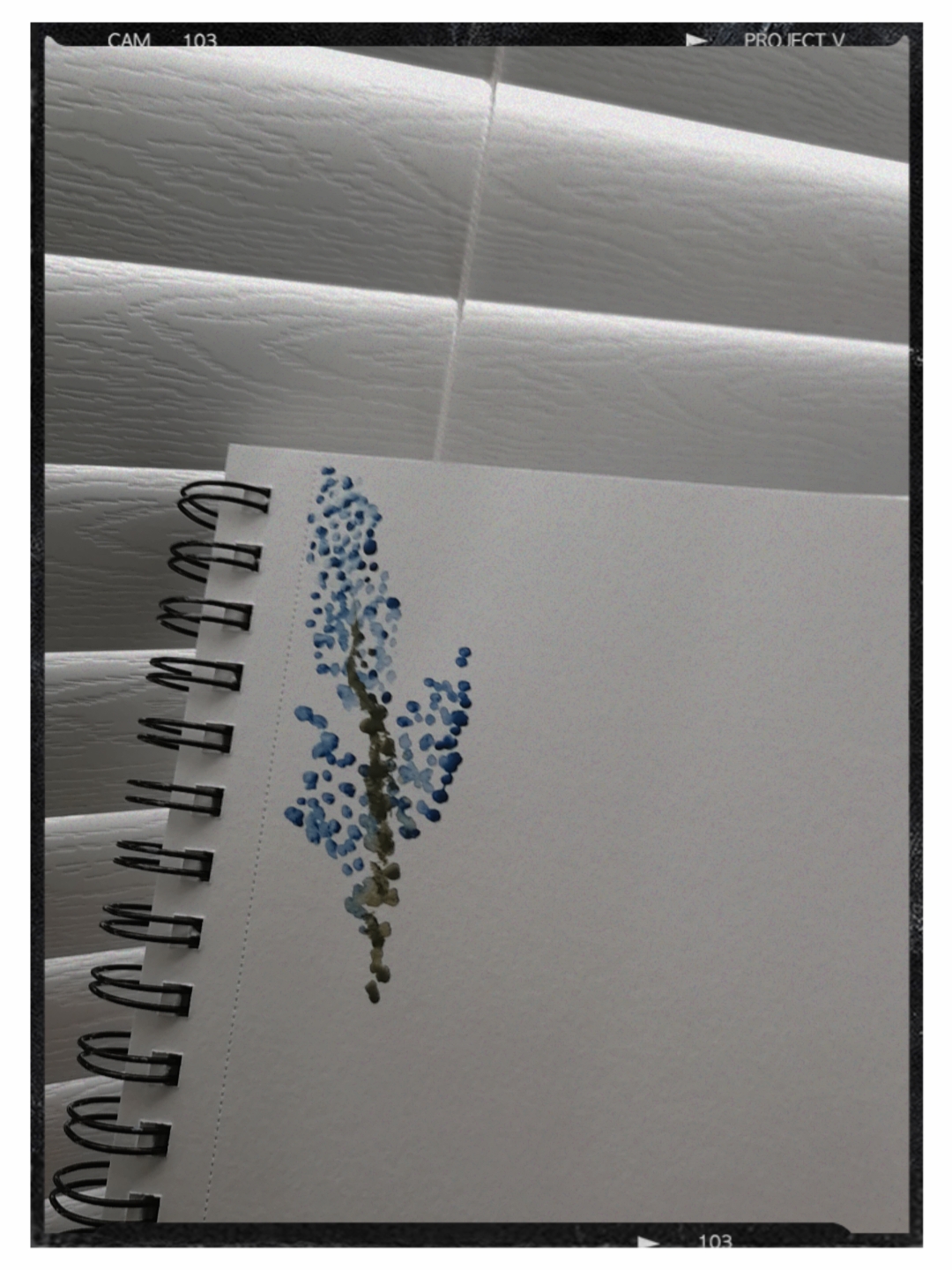
Stippling
Stippling is method where you can add great detail into your paintings. This technique involves individual dots that are used to imply the shape, texture, or shadowing of a subject. This technique is the balance of a negative and positive space. If you glance at a stippling painting from afar, you’ll be forced to fill in the empty spaces. It’s a great approach if you want to try something new, some people think of it as one of the easiest techniques but in reality, it isn’t. Especially if you’re advanced in art, you can create whatever you want to express. Beware though, stippling takes a lot of time and patience.
I painted a simple flower, using this technique!
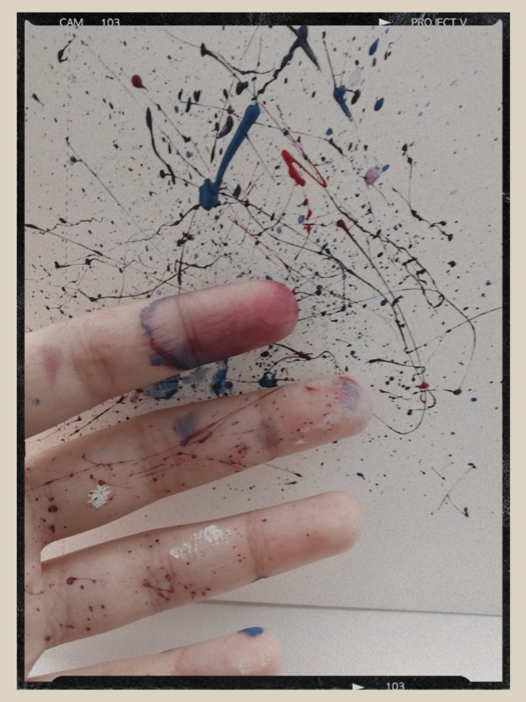
Splattering
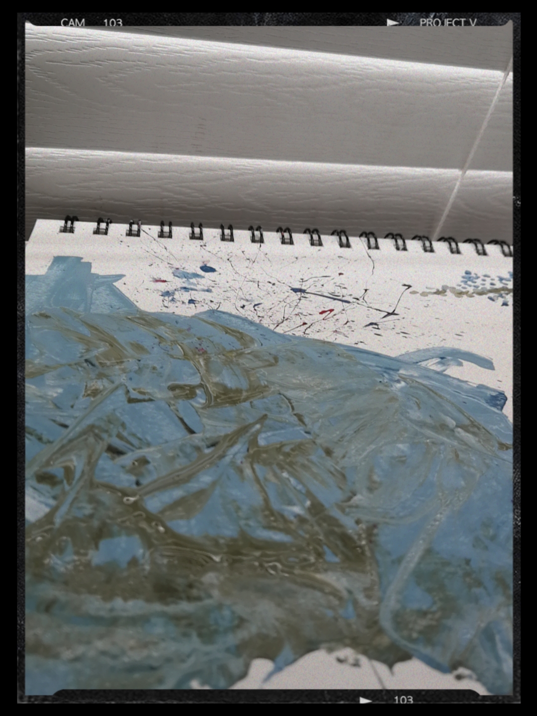
Splattering is one of the easiest techniques, you hold the bristles of your paintbrush back and then you let go! This will create a splattered effect on your surface. You can play around with water and the paint, mix a tad amount of water into the paint and then it replicates the texture of watercolours. The watercolour texture creates a transparent look.
Your hands will get messy!
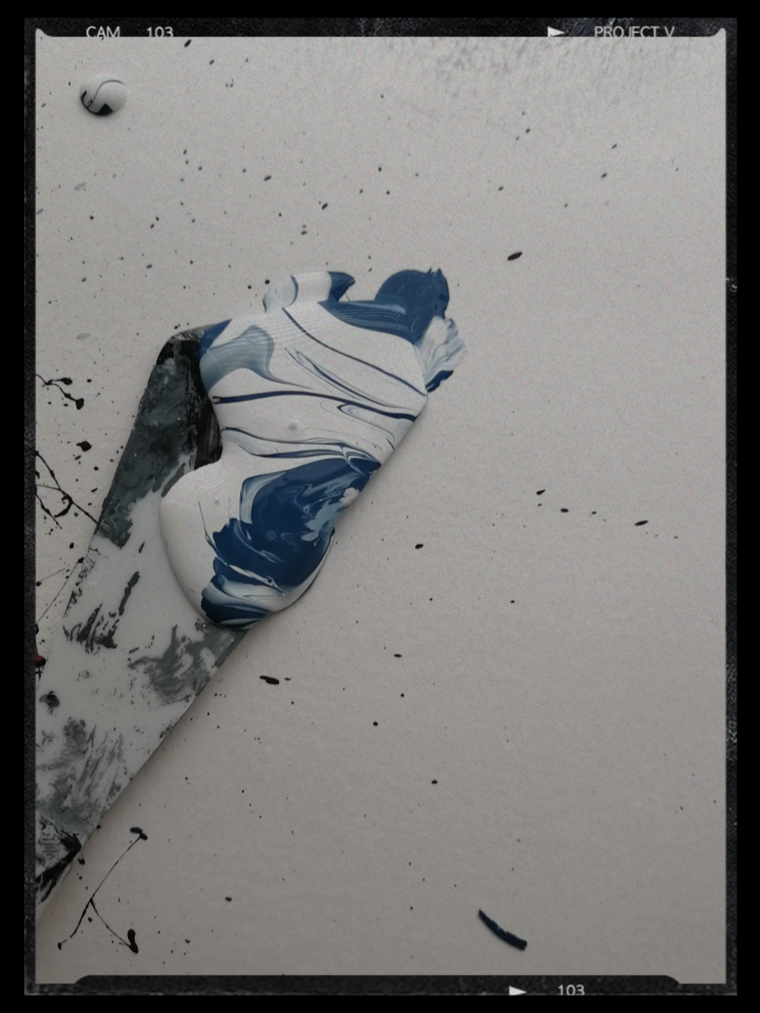
Using a Painting Knife
This is probably my favourite tool. I prefer using the painting knife over a brush, it allows me to emphasize important details in my artwork. This process can help you construct a variety of effects, from strokes to more refined details. If you mix the paint with a palette knife you can create a thick buttery texture (as I stated before in the introduction). This can create a smooth finish on the surface or a rough finish. It’s better to have thick paint when executing this technique, this is because, the paint will be able to hold it’s shape on the surface. You can use the edge of the knife to create sharp lines, you can also create bold strokes using the palette knife (more broad and thick), this balances out with the delicate strokes that were made by a brush.
You can see the sharp lines, it’s watery because I didn’t mix the paint. The result would have been better if I had.This is a palette knife
Conclusion
I hope that you learned some techniques and will apply them into your artwork. These techniques can make your paintings more thorough and detailed, and overall, make them look amazing!
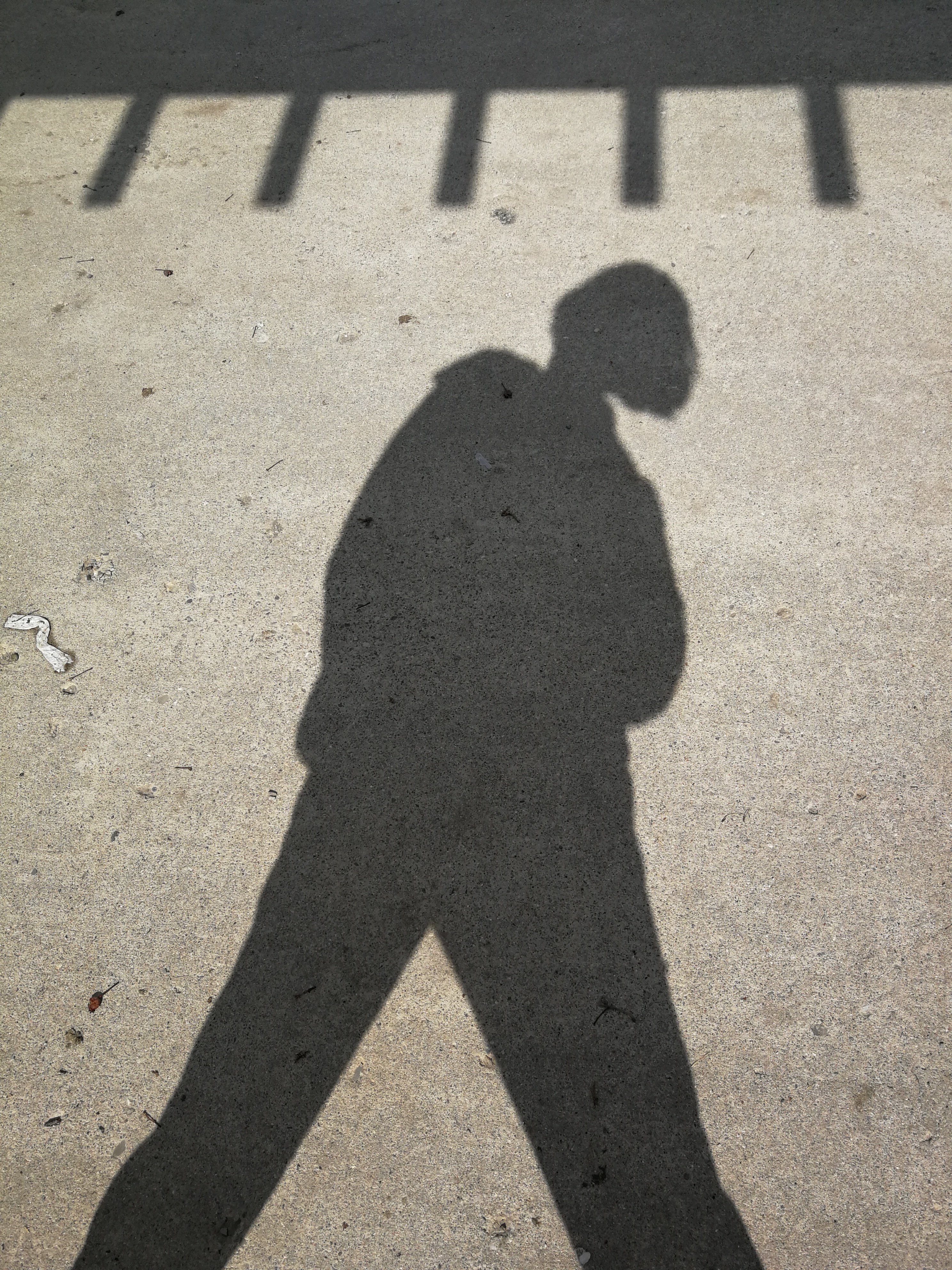
There are countless moments where I sit on my bed while visualizing images in my mind. Finding inspiration and the motivation to actually work on something, is very difficult.
When my mind is blank, I usually do these three things;
Go Outside:
Whether it’s going to the park, sitting on my porch or even taking a stroll. I usually feel more inspired when I have things to observe. I can’t really observe much when I’m in my home/room. So, you should go out and experience new things, thats one way to feel inspired and motivated.
Since spring has begun, it’s going to get warmer and there will be much more to view than just snow.
Scour the Internet:
Looking at many things such as, objects, people, flowers or buildings can help me visualize a situation. Most of my paintings depict my inner emotions or real life issues and problems that society has. I will spend hours just researching things and coming up with different colours to use and different values.
Researching is definitely helpful when your mind is blank. Looking at different forms of art, objects, literally anything can help you visualize different elements that you could put in your piece.
Listen to Instrumentals:
Listening to instrumentals of songs help me calm myself and put my undivided attention into creating my painting/piece. I feel like I’m in a completely different universe when I listen to instrumentals. I can also get a lot done and come up with new brillant ideas.
Music helps people develop positive self-image, and it also a way to distress and get rid of unpleasant thoughts. Personally, when I listen to music and do art, I can represent those feelings in my piece, and I won’t feel as stressed anymore.
Conclusion,
Everyone has different ways to become inspired and there are various things that people do. There are many things that I do to find inspiration as well but these are the factors that help me the most. Hopefully these can help you too.